this post was submitted on 19 Jul 2024
392 points (95.0% liked)
memes
10390 readers
2103 users here now
Community rules
1. Be civil
No trolling, bigotry or other insulting / annoying behaviour
2. No politics
This is non-politics community. For political memes please go to !politicalmemes@lemmy.world
3. No recent reposts
Check for reposts when posting a meme, you can only repost after 1 month
4. No bots
No bots without the express approval of the mods or the admins
5. No Spam/Ads
No advertisements or spam. This is an instance rule and the only way to live.
Sister communities
- !tenforward@lemmy.world : Star Trek memes, chat and shitposts
- !lemmyshitpost@lemmy.world : Lemmy Shitposts, anything and everything goes.
- !linuxmemes@lemmy.world : Linux themed memes
- !comicstrips@lemmy.world : for those who love comic stories.
founded 1 year ago
MODERATORS
you are viewing a single comment's thread
view the rest of the comments
view the rest of the comments

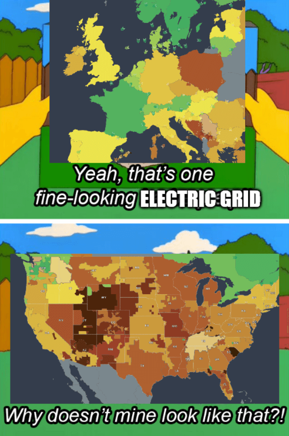
People underestimate just how massive California is. There are a lot of people across a large span of land that require electricity. I imagine the map would look very different if it was scaled by population.
my wording has failed me immensely. i would at least expect people to look at the map and realize what I'm actually trying to say but here we are. that is my point. California has like the population of all these states combined yet all of them are producing more carbon emissions. when i said "winning" i meant in amount of carbon emissions, meaning doing worse.