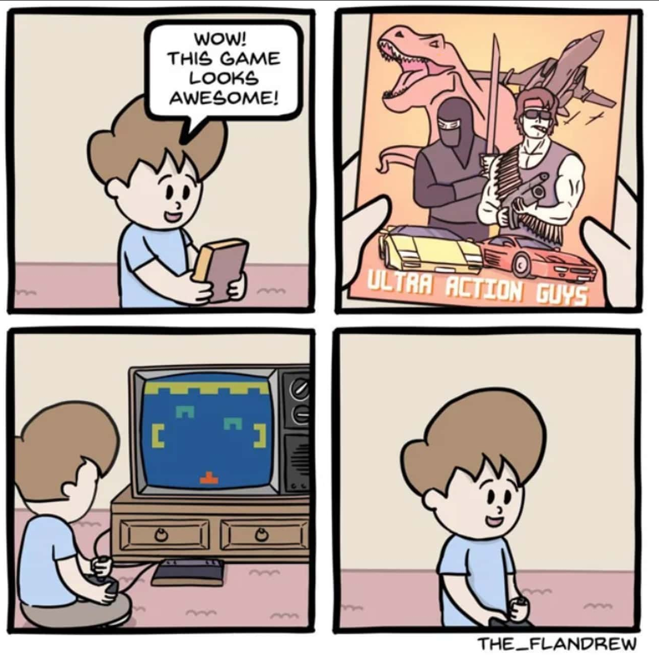
I remember playing Doom for the first time and I remember thinking that graphics would never get any better than that. Like the arm even moves when he walks!
How horribly naïve I was.
Vintage gaming community.
Rules:
If you see these please report them.
I remember playing Doom for the first time and I remember thinking that graphics would never get any better than that. Like the arm even moves when he walks!
How horribly naïve I was.
5 year old me thought it looked photorealistic.
That was Mortal Kombat when I was 15
But mortal Kombat WAS photorealistic (in my head)
They did have people dress as the fighters and do poses and then took photos of them and turned these photos into sprites.
So the game was photorealistic (that is within the technological boundaries of the platforms the game ran on).
I'd love to see a 2D Mortal Kombat with the original photos taken from what we may consider the OG Mortal Kombat cosplayers.
My peak game i think it was F.E.A.R., my pc couldn’t run it at full but I remember thinking it couldn’t possibly get any better than that
I remember feeling the same way with Myst. "It even has video!"
grew up with c64, spectrum+3, master system, genesis, nes, snes. So when I bought a ps1 with my paper round money and started up the intro to Soul Blade, that would become Soul Calibur, the graphics jump shook me to my core and brought tears to my eyes. I was like "THIS is the peak of graphics. Nothing can beat this.
Here's the video: https://www.youtube.com/watch?v=5Jscuco8zEk
I had those moments multiple times. I remember thinking the same about International Karate on the Amiga. Then my mind was blown with Street Fighter II, Max Payne was one for sure as mentioned elsewhere and let’s not forget Carmageddon, which got a little bit too realistic. Graphics technology developed so fast, you can’t compare it to today’s upgrades. As I’m older now 10 year old games still feel “new” to me.
As I’m older now 10 year old games still feel “new” to me.
It's not just you getting older, it's also diminishing returns.
It takes more and more effort, both in manpower as in graphical processing power, to make graphical leaps, and the visible returns are getting less.
You can compare it to video formats:
Well, 8k is in allmost all home-usecases useless, 4k a better choice. Except maybe for video walls. Eye resolution is limited by angular resolution (visual acuity).
@lobut I thought Donkey Kong Country on the SNES was photorealistic and rivaled movies like Terminator 2, which used the same technology behind the scenes. I thought every game would look the same as Donkey Kong Country in future.
No way would that kid be frowning. If this was legitimately in the late 70s or early 80s that kid would be ecstatic with the graphics.
Always so kick ass
Always?
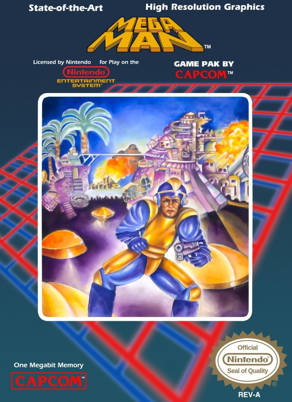
Have you seen the cover art for the first MegaMan game? lmao

Even funnier with the boasting of "state of the art high resolution graphics" at the top. Though to be fair, the actual game looks infinitely better than that cover.
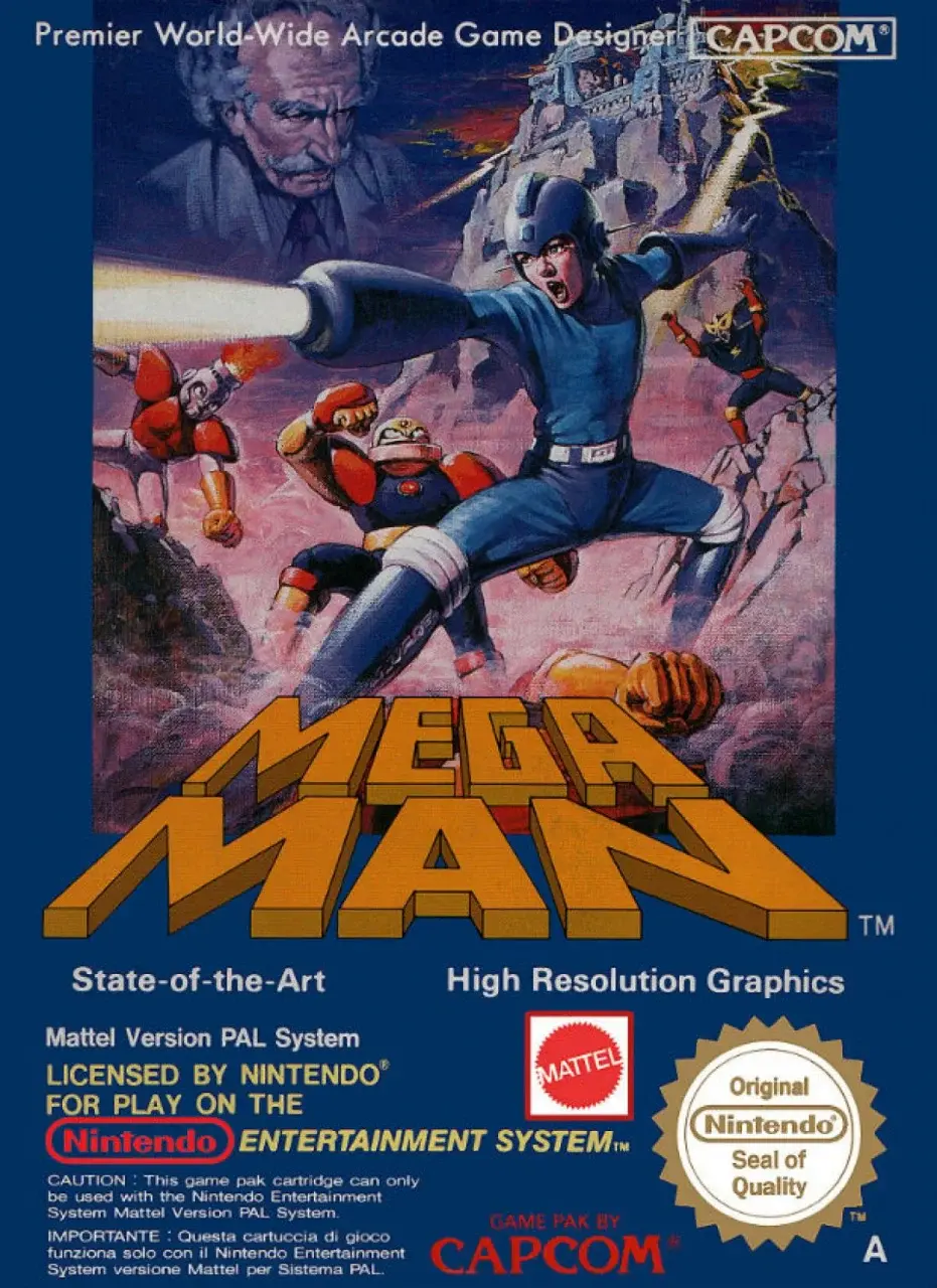
On the other hand, the European box art is fucking awesome

Other than Dr. Wiley lookin' like fuckin' Mark Twain, that is pretty sick. Actually, fighting Mark Twain would be sick, too.
I don't know which I love better
Even funnier with the boasting of "state of the art high resolution graphics" at the top.
At the time, this want really that inaccurate. There weren’t many video games with the same quality.
The only reason it’s laughable now is because it’s been 35 years since the claim was made.
He does make a face like he doesn't want to be seen in that suit and with his frog legs.
Looking at this cover art again now, it kinda reminds me of AI-generated art lol
I love bashing AI art but in AI art it's usually the details that you spot at second glance that makes it fall apart. The Mega Man cover is just fundamentally messed up to a degree where even AI art is miles ahead.
Yeah true, AI art is more "looks OK at first glance, but smaller details are messed up", while this one is the opposite of that so "smaller details are actually fine, but as a whole it looks quite messed up" haha


I present Rigby, named after the finest dumbest fucking raccoon ever.
My favorite

I love this one. Why is his face off center? Why does he have a normal gun?
The 80s
I love that they brought back Bad Box Art Mega Man in Street Fighter x Tekken
VHS covers were the same way.
Also, it's a terrible movie that was on Mystery Science Theater 3000.
It depends on the movie, og terminator VHS slip art is fucking great. Also honorable mention to monty python and the holy grail.
Except in the case of the Sega Master System, where the simplistic 8-bit graphics felt like a massive leap up from the terrible box art!

probably the nostalgia talking, but it was satisfying having all your games look the same on the shelf
Remember the coverart for Phalanax and how it had NOTHING to do with the game at all? And when asked the company said they simply put a cover they thought would be eyecatching.
Why a random old coot with a banjo on a rocking chair would accomplish that is beyond me
When everything is spaceships and big men with guns. You might ask whats this thing with old man and a banjo?
This is how I feel about mobile games. Even the good mobile games will have some epically animated scene that shows all out war between a bunch of magical badasses with explosions and all kinds of epic shit.
Then the gameplay is some low effort turn based game where the characters barely move and the attack effects are pathetic light shows.
Last panel inaccurate, games were vibrant and awesome
Just like the ones today that will feel amateurish compared to future immersive games. Give it time
Perhaps like this?

I like this version better!
A couple of examples from the comments of another post:

Source of the image: Retro 19 – Abu Simbel, Profanation | Commodore Spain
:format(jpg)/f.elconfidencial.com%2Foriginal%2Fc2b%2F58f%2Ffdd%2Fc2b58ffddd6e5f5a2dc1329060c564b6.jpg)
Source of the image: El confidencial
For me the worst was handed down PS1 games with awesome CD art... that just wouldn't load ☹️
And later we were further deceived with cut-scenes that were so much better than the gameplay.
Idk dude, Ultra Action Guys looks pretty fuckin rad.