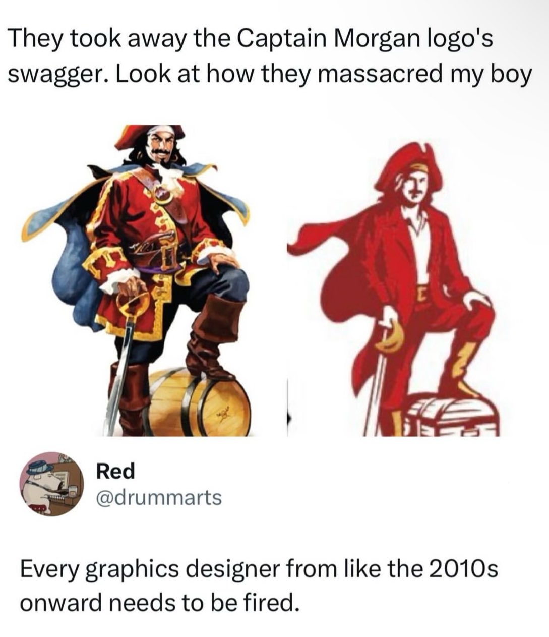
I mean, as far as these new logos go, it's not the worst.
this post was submitted on 25 Apr 2024
1138 points (97.6% liked)
People Twitter
5274 readers
859 users here now
People tweeting stuff. We allow tweets from anyone.
RULES:
- Mark NSFW content.
- No doxxing people.
- Must be a tweet or similar
- No bullying or international politcs
- Be excellent to each other.
founded 1 year ago
MODERATORS
Rum is horrible anyway. Who cares. But yeah, terrible new mascot. The cosplay comments are spot on.
Edit: you want a gawdawful hangover? Rum is your copilot.
As little a hangover as possible? Straight vodka.
Sipping a complex drink with thousands of years of history? Proper single malt whisky from Scotland.
i have no idea what this brand is supposed to be but...
tbh i don't see anything wrong with the right one
logos are supposed to be simple-ish, use minimal amount of colors and be scalable and it sure does a better job with it's reduced color palette and vector shapes
the one on the left should be reserved for e.g. illustrations
load more comments
(1 replies)
Who drinks this shit anyways?
