this post was submitted on 21 Oct 2024
853 points (98.9% liked)
RetroGaming
19602 readers
390 users here now
Vintage gaming community.
Rules:
- Be kind.
- No spam or soliciting for money.
- No racism or other bigotry allowed.
- Obviously nothing illegal.
If you see these please report them.
founded 1 year ago
MODERATORS
you are viewing a single comment's thread
view the rest of the comments
view the rest of the comments

It's the same with lots of indie games now. Oh, and mobile ones too
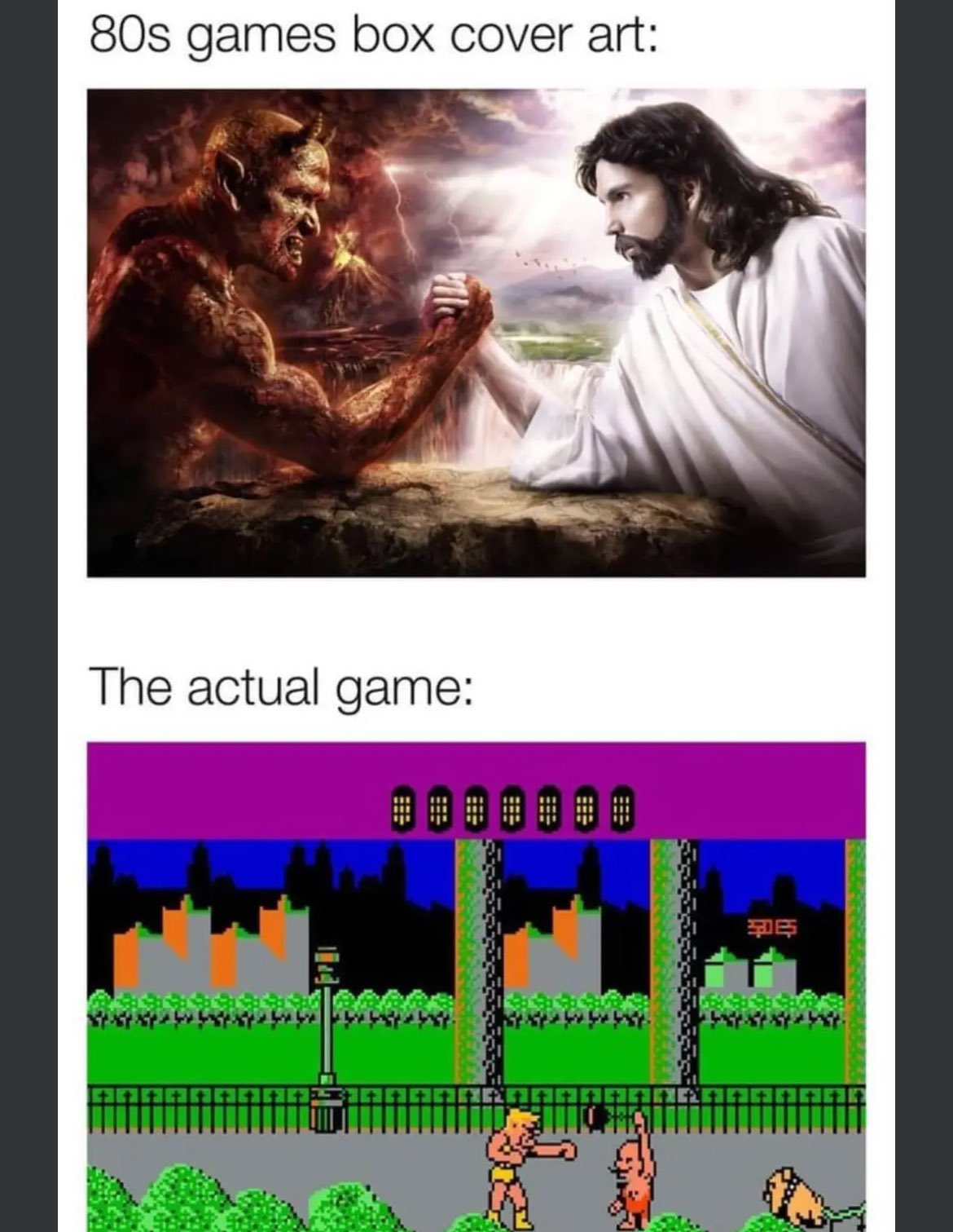
Back in the day, deep down you knew what you were really getting. I'm a little annoyed these days when indie games use marketing visuals that look like they could be in-game for a modern title and then it's all pixel art style. I get that you don't make a pixel art poster, but in that case, go all-in on an art cover don't let it be mistaken for game graphics.
The first game that always comes to my mind in that regard is Super Time Force Ultra. It kept showing on my steam page for weeks on end years ago, with a cartoony-looking cover and "minimalistic pixel" style for actual gameplay
Bro, that stupid game with the guys that shoot barrels to get more fighters/better weapons looked fun. The actual game is a shitty base builder with timed progression, of course you can pay to get past the time locks. Fuck that company and every "influencer" that takes their dirty money.
I mean, from the ad it could be any of 4123984716239 shitty games on the play store. The last one ad I remember using that was Evony, which I'm surprised still fucking exists. That piece of shit has been a meme since 2010
LMAO, I got super into Evony. Even coded a bot myself to run my rogue base 24/7 so my guild could attack it for massive loot. I totally got suckered by their ad. That was like 2008/2009.
Back when XBLA got going there were so many games with anime character art that ended up being meh side-scrolling platformers with 8-bit pixel graphics. Looking at the Nintendo eShop... not much has changed. 😄