this post was submitted on 01 Nov 2024
518 points (97.4% liked)
Data is Beautiful
4964 readers
1 users here now
A place to share and discuss visual representations of data: Graphs, charts, maps, etc.
DataIsBeautiful is for visualizations that effectively convey information. Aesthetics are an important part of information visualization, but pretty pictures are not the sole aim of this subreddit.
A place to share and discuss visual representations of data: Graphs, charts, maps, etc.
  A post must be (or contain) a qualifying data visualization.

  Directly link to the original source article of the visualization
    Original source article doesn't mean the original source image. Link to the full page of the source article as a link-type submission.
    If you made the visualization yourself, tag it as [OC]

  [OC] posts must state the data source(s) and tool(s) used in the first top-level comment on their submission.

  DO NOT claim "[OC]" for diagrams that are not yours.

  All diagrams must have at least one computer generated element.

  No reposts of popular posts within 1 month.

  Post titles must describe the data plainly without using sensationalized headlines. Clickbait posts will be removed.

  Posts involving American Politics, or contentious topics in American media, are permissible only on Thursdays (ET).

  Posts involving Personal Data are permissible only on Mondays (ET).
Please read through our FAQ if you are new to posting on DataIsBeautiful. Commenting Rules
Don't be intentionally rude, ever.

Comments should be constructive and related to the visual presented. Special attention is given to root-level comments.

Short comments and low effort replies are automatically removed.

Hate Speech and dogwhistling are not tolerated and will result in an immediate ban.

Personal attacks and rabble-rousing will be removed.

Moderators reserve discretion when issuing bans for inappropriate comments. Bans are also subject to you forfeiting all of your comments in this community.
Originally r/DataisBeautiful
founded 2 years ago
MODERATORS
you are viewing a single comment's thread
view the rest of the comments
view the rest of the comments

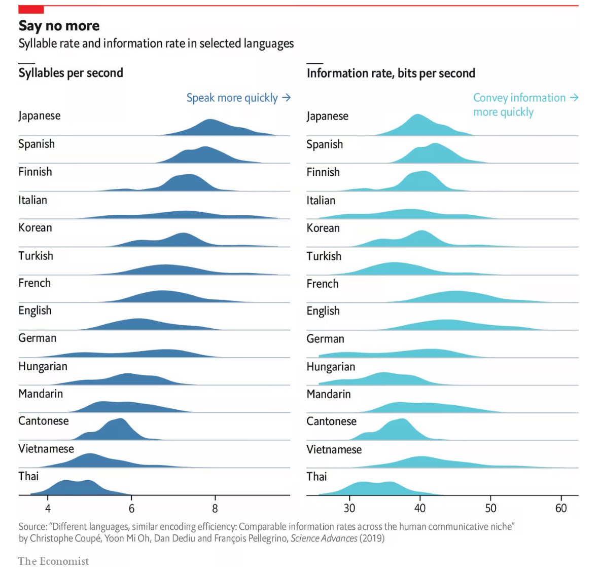
English is pictured as such a smooth, almost perfectly normalized bell curve. On one hand it's such a versatile language that (largely due to colonialism) has undergone so much evolution and mixing with other languages that I can believe that. On the other hand it looks almost too normal. Odd.
It could indicate bias on the part of the researchers. I haven't read their methodology, but in my amateur study of languages, some languages have some interesting tricks for communication that don't translate to English well or efficiently. If English was used as the baseline, then the study ma not incorporate some of the neat things other languages can do as points to measure.
Mandarin has a word particle to communicate "completed action". This is used instead of conjugating verbs for tenses. Example: in English you might say:
"I went to the shop" 5 syllables
In Mandarin the literal translation back to English would be:
"I go to the shop [completed action]" 5 syllables
For the two measures listed of essentially Information Density and Speech Velocity, this benefit wouldn't show up, but if you're measure for something like Encoding and Decoding Burden (I'm making up these terms), then Mandarin could rank higher.
Looking up the article the baseline is French and English I'd say. So it might be biased, but I didn't read the article and even if I did, I'm a chemical engineer so what do I know of this field.
Could be bias. But, I wonder if it could be because English has borrowed so much from other languages.
It’s also interesting that English and French look so similar in the graphs. Both, have been the de facto international language for a long time.