this post was submitted on 20 Nov 2024
119 points (82.5% liked)
NoSafetySmokingFirst
484 readers
131 users here now
Welcome to NoSafetySmokingFirst!
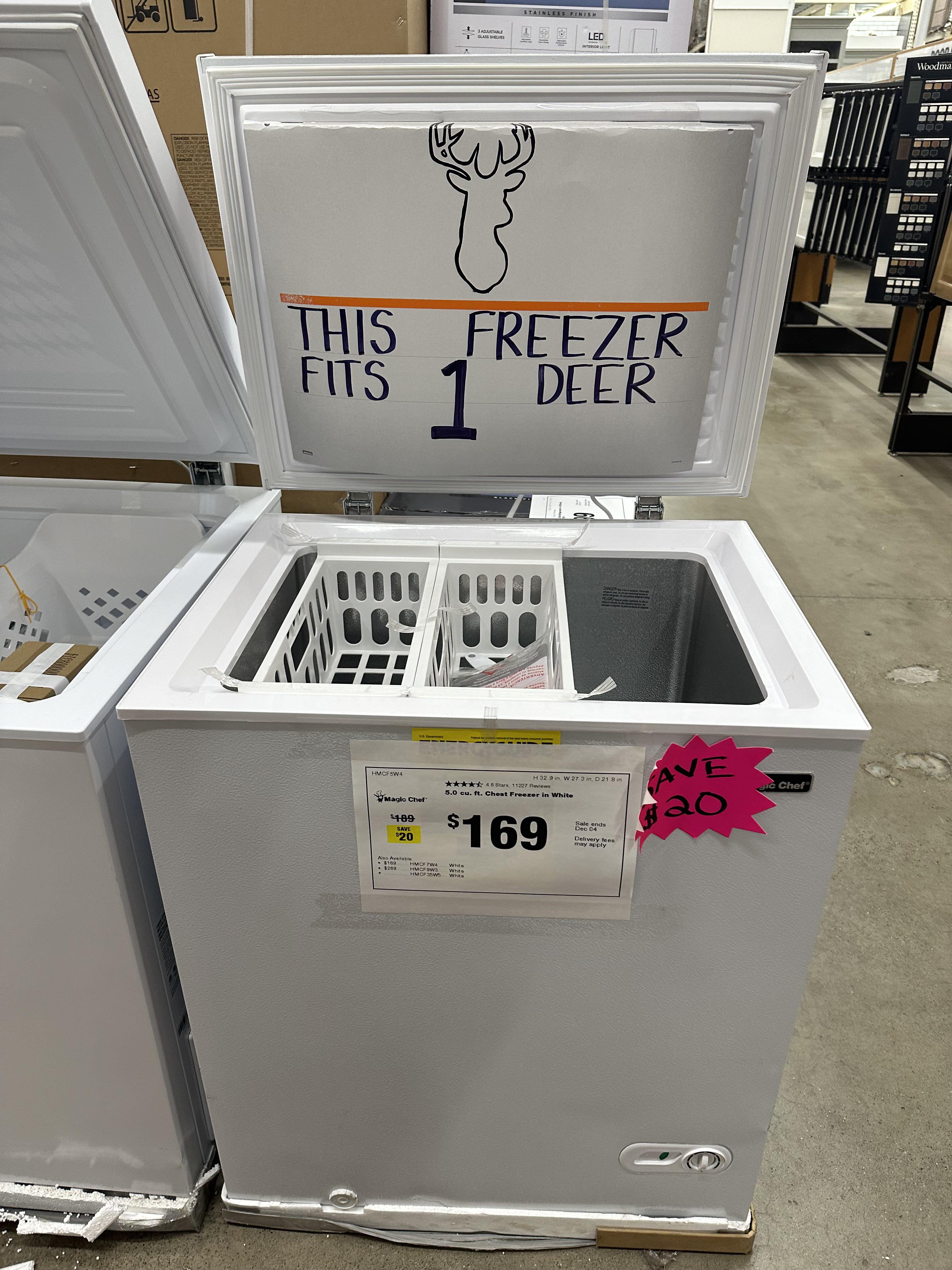
For images where the text reads correctly left to right, but visual cues (like colouration, vertical proximity, or horizontal separation) lead you to try to read it top to bottom.
This is similar to, but distinct from, the more widely known “DontDeadOpenInside” format. In that case, the text reads correctly top to bottom, but visual cues (like colouration, horizontal proximity, or vertical separation) lead you to try to read it left to right.
The post that started it all:
Other related communities:
- !dontdeadopeninside@lemmy.ohaa.xyz
- !yelldowlgyel@sopuli.xyz (letters arranged in any confusing order)
founded 2 months ago
MODERATORS
you are viewing a single comment's thread
view the rest of the comments
view the rest of the comments

It wouldn't fit on "DontDeadOpenInside", but I think it fits here, no?
I personally see no need to draw the distinction between the two, I mean I know that subcultures are fractal and there's no bottom but I'm okay with one community for text usually signs that isn't clear how it's supposed to be read at first glance.
How dare you imply such a thing! The two formats are nothing alike! ;)
I was just thinking that