this post was submitted on 02 Dec 2024
182 points (95.0% liked)
Fediverse
28576 readers
425 users here now
A community to talk about the Fediverse and all it's related services using ActivityPub (Mastodon, Lemmy, KBin, etc).
If you wanted to get help with moderating your own community then head over to !moderators@lemmy.world!
Rules
- Posts must be on topic.
- Be respectful of others.
- Cite the sources used for graphs and other statistics.
- Follow the general Lemmy.world rules.
Learn more at these websites: Join The Fediverse Wiki, Fediverse.info, Wikipedia Page, The Federation Info (Stats), FediDB (Stats), Sub Rehab (Reddit Migration), Search Lemmy
founded 2 years ago
MODERATORS
you are viewing a single comment's thread
view the rest of the comments
view the rest of the comments

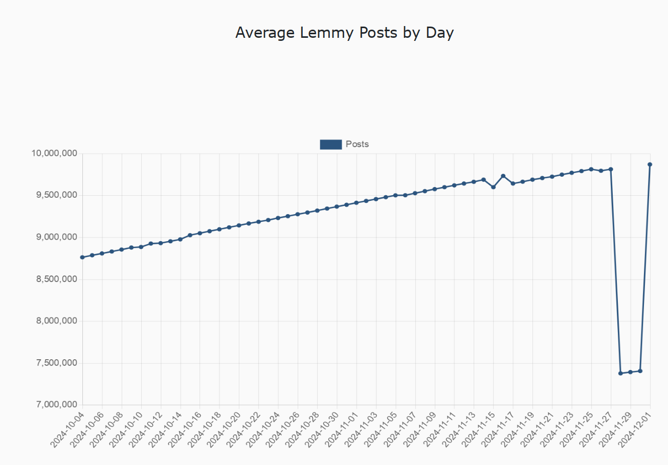
And the above was literally how I was thought to represent data in university. Maximize the areas of interest, make sure to properly label your axes (lest they become misleading), and remember to trim empty space where relevant.
But it appears that proper graphs for science and engineering reports may not be used for representing data to the common man, as it must be assumed that, even for the most simple of graphs, the common man will only look at the funny line, but not the graph itself.