this post was submitted on 15 Jan 2025
738 points (94.4% liked)
Fediverse
28936 readers
1116 users here now
A community to talk about the Fediverse and all it's related services using ActivityPub (Mastodon, Lemmy, KBin, etc).
If you wanted to get help with moderating your own community then head over to !moderators@lemmy.world!
Rules
- Posts must be on topic.
- Be respectful of others.
- Cite the sources used for graphs and other statistics.
- Follow the general Lemmy.world rules.
Learn more at these websites: Join The Fediverse Wiki, Fediverse.info, Wikipedia Page, The Federation Info (Stats), FediDB (Stats), Sub Rehab (Reddit Migration), Search Lemmy
founded 2 years ago
MODERATORS
you are viewing a single comment's thread
view the rest of the comments
view the rest of the comments

If you're happy to be corrected, then let me please help.
Exponential growth is dependent on the original size, and is usually a multiple of that size. 10 going to 20 then going to 40 then going to 80 is exponential growth.
10 going to 20 then to 30 then to 40 is linear growth. The increments are not related to it's original size.
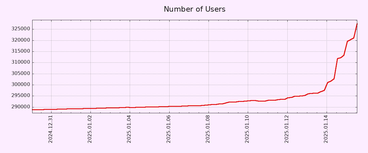
Going from 290k to 320k is barely a 10% increase. The way the graph is clipped LOOKS like an exponential line, but that's because it's clipped. If we showed the full data, 0 to 320k, it would not at all look exponential.
And even if we drop the mathematical meaning and go with the colloquial meaning, when people say exponential they usually mean doubling. So 290k to 580k.
People are calling you out because you exaggerated too hard. You called 10% growth exponential. That's just wrong on the face of it.
Now I will wait and see if you lied to me about being happy to be proven wrong.
Again, as mentioned several times, the original post says the line went vertical, which it just objectively did. You could change the timeline and it might not look so vertical, for example making it show every day or every few hours, but that would be less honest imo. Even zooming out 120 days, which is the maximum time frame I could find for this data (https://pixelfed.fediverse.observer/dailystats&days=120), it is still a straight vertical line, and very clearly the fastest it has grown for a while. That's not misinformation or exaggeration, it just simply isn't.
As far as exponentiality, the growth rate is absolutely exponential. From the 10th to the 12th, it grew by 2500, then from the 12th to the 14th it grew by 5000 users. Then from the 14th to the 16th it grew by 25000. So if you want to get really technical, it's not exponential because it's more than doubling each day, it's starting approach factorial growth. So I guess I will cede that technicality, but the point remains, if I was in a statistics course and someone told me to identify the type of trend that this graph represents, I would personally go with exponential. You're free to make your own interpretation of what sort of trend the graph shows, but you would be wrong. It's not my fault that you and others are conflating exponential number growth with exponential growth rate. I never claimed the raw number of users was growing exponentially, just that the rate of growth was exponential.
Now go ahead and call me a liar for stating facts.
Ahhh, I see the problem.
What you said sounded like "membership is growing exponentially", which is false.
What you intended was "The rate of membership growth is growing exponentially". Which is true.
These are two very different things. If you truly meant that second one in your comment, then all I can say is you chose some very strange wording for it. And I'm not the only one that misunderstood.