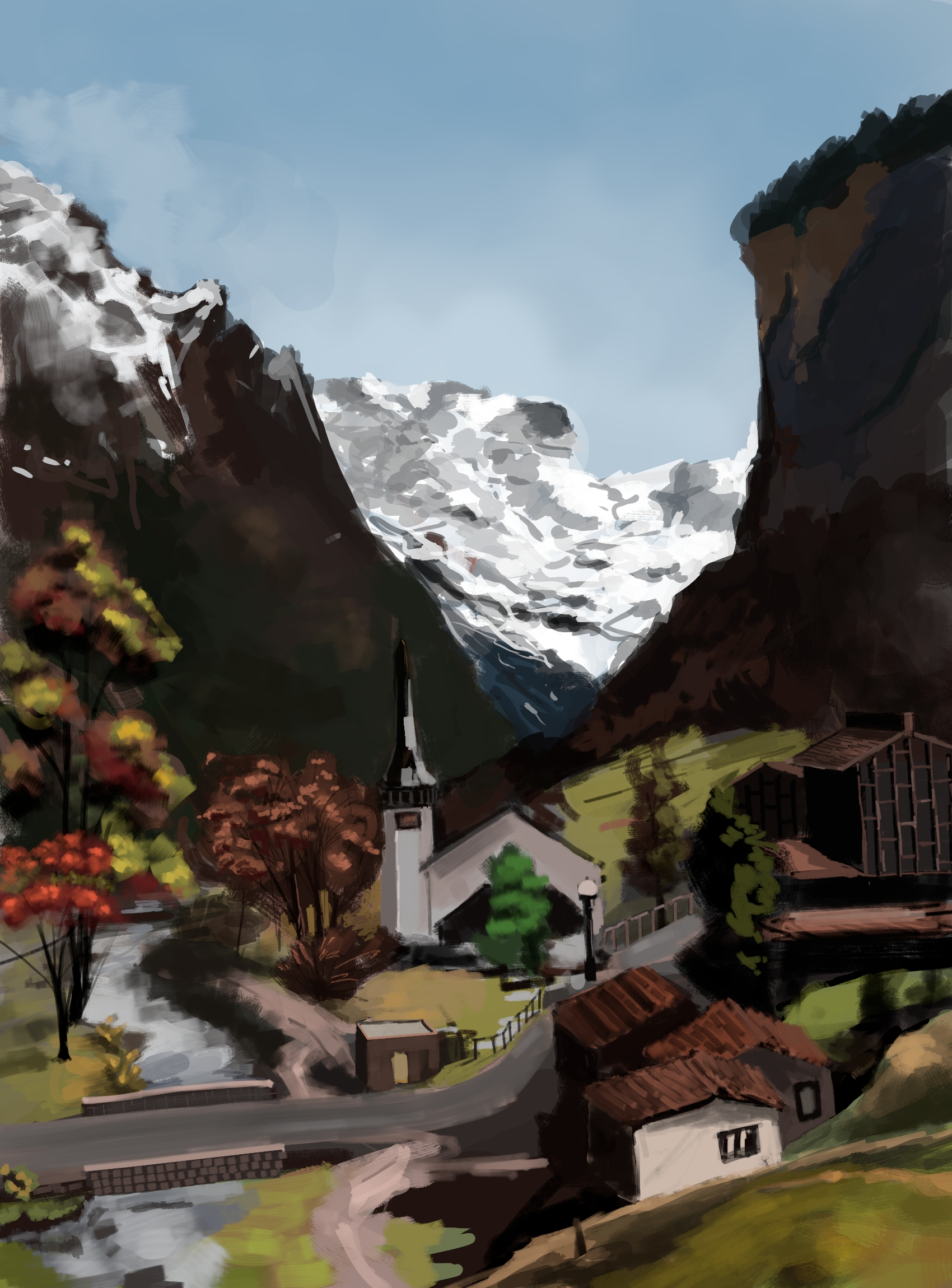
I share it even though it's not very good only because I'm using internet as a my journal lately. lol. I hope you don't hate it too much!
This is a friendly community for everyone who wants to share their art with the world! Everyone is welcomed 🎨
Rules
AI Art: While we appreciate AI generated art, there are more appropriate communities to post that type of art to. Please keep posts to non-AI generated art only. This rule includes AI art that was then manually manipulated (e.g. drawing on top of something generated by AI).
Nudity: Nudity is and has always been a part of art, but it may be something that some users don't wish to see or cannot view in certain circumstances (e.g. at work). If your work contains nudity, please mark it as NSFW. Work that contains nudity that is not marked as NSFW will be taken down. As long as the NSFW tag is used, we welcome nude subject matter.
Spam: Please do not spam this community. Self promotion is fine if you just want people to be aware of your work, but blatant attempts at spam will result in the past being removed and possibly a ban. If you aren't sure if what you are posting is spam, please contact the moderator first.
Conduct: Be nice, and don't be a jerk. Constructive criticism is OK, but don't be mean. Encouragement is always welcomed.
I share it even though it's not very good only because I'm using internet as a my journal lately. lol. I hope you don't hate it too much!
Contrast is high between middle mountains, and everything else. My eye has a hard time focusing. Try and reduce that big contrast jump. Otherwise i think each part is quite nice. Keep it up.
That looks pretty fantastic to me! Please keep it up!
I enjoyed the hidden face in the mountain
Are you kidding, that looks awesome! Is this Lauterbrunnen?
Oh, I just looked and yes it's probably that. I didn't completely follow the reference picture but that church building looks like it's from Lauterbrunnen.
Can confirm I immediately saw Lauterbrunnen in your painting! Amazing work btw
Looks good for me. Be aware that while you see more the imperfections, we see more then general picture.
thank you!
I think it's really good!
There is an often-repeated story about Bill Watterson (the Calvin and Hobbes creator) destroying his first 500 paintings. That's how much practice he thought he needed before his work was good. If you are not satisfied with your work, then just consider this one of your 500 pieces and keep going!
~~failing~~ learning
(possibly still miserably, but that puts you in company with Van Gogh, etc.)
Keep growing!
lol, not like Van Gogh, poor soul had been dealt with a very difficult life.
I like this! I like it a lot, and I'd be proud to have painted it. The general aesthetic appeals to me, and I'm particularly fond of the left half of the valley. I love the color work, how loud the highlights are against the darker colors without being offensive to the eye; it's a very visually striking style.
Only read if you want constructive feedback:
If I had to guess what's "wrong", I'd say that it's that the detailing over distance is inconsistent. You've got some things that are sharply detailed at a far distance (the church) and other things that are loosely detailed at that same distance (the trees). The line work also seems a little wobbly (speaking as someone who does vastly worse line work). The last thing is that the very far off snow is really, really, really bright, which seems to suggest to the eye that it's much closer than it ought to be.
I agree with you assessment. Consistency in detail is an issue here. I changed my mind few times while painting it, whether to make the details loose or closely knit.
I'm looking at it with fresh eyes and I can't help but notice that it's mostly natural things that are loosely detailed and everything built, save for the road, is sharply detailed. Was that on purpose?
haha, no. It's just lack of commitment, I wasn't sure where I wanted to keep the focus so everything came haphazardly. When I see finished art pieces on the web, artists usually mention the time they spent on it. It's like 10, 12 hours sometimes. I sort of give up after 2 hours. Very rarely I paint for 3 to 4 hours and difference is noticeable in those pieces.
That's a perfectly valid art style! This is pretty much me when I work in physical media because I can't devote much time to it and doing it over multiple sittings takes more planning than I want to do. For some reason, I'm more comfortable taking my time with digital, though.
Nice job my friend!
Thank you!
art is permission to fail.
and you don't get better without failing a lot.
We are our own worst critics, no one in this thread is zooming in and seeing all the things you know you did wrong. as a finished work it is pretty good.