I just got the update yesterday and I hate this new setting. I like to know if people are downvoting things I've posted! Seeing a post that just shows 3 total upvotes and nothing else is much different than seeing that my post got 25 upvotes and 22 downvotes. This changes the entire vibe of the app and kind of makes me just not want to bother posting anymore...
Jerboa
Jerboa is a native-android client for Lemmy, built using the native android framework, Jetpack Compose.
Warning: You can submit issues, but between Lemmy and lemmy-ui, I probably won't have too much time to work on them. Learn jetpack compose like I did if you want to help make this app better.
Built With
Features
- Open source, AGPL License.
Installation / Releases
Support / Donate
Jerboa is made by Lemmy's developers, and is free, open-source software, meaning no advertising, monetizing, or venture capital, ever. Your donations directly support full-time development of the project.
Crypto
- bitcoin:
1Hefs7miXS5ff5Ck5xvmjKjXf5242KzRtK - ethereum:
0x400c96c96acbC6E7B3B43B1dc1BB446540a88A01 - monero:
41taVyY6e1xApqKyMVDRVxJ76sPkfZhALLTjRvVKpaAh2pBd4wv9RgYj1tSPrx8wc6iE1uWUfjtQdTmTy2FGMeChGVKPQuV - cardano:
addr1q858t89l2ym6xmrugjs0af9cslfwvnvsh2xxp6x4dcez7pf5tushkp4wl7zxfhm2djp6gq60dk4cmc7seaza5p3slx0sakjutm
Contact
Bring back please
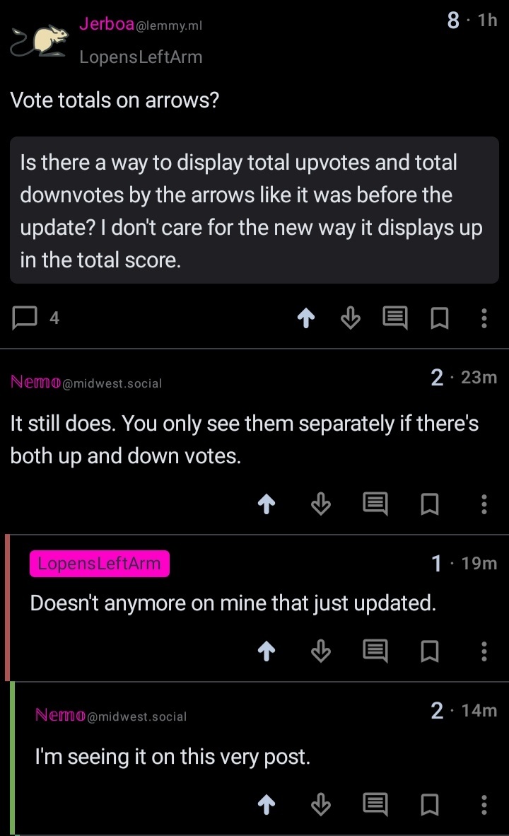
It still does. You only see them separately if there's both up and down votes.
Doesn't anymore on mine that just updated.
I'm seeing it on this very post.
I'm not seeing it on this post, no numbers next to the arrows.

I have this issue as well. Sometimes I can see them and sometimes I can't
Pre 0.0.60, the rules for showing the votes in arrows were -> show scores setting enabled + and if there are downvotes
Now with 0.0.60 Dessalines reworked how the votes are displayed.
Modes (all in header):
- Display full -> show score and downvotes
- Display score + upvote ratio
- Display score
- Hidden
They will be configurable once the setting is persisted.
I have proposed to add a Display votes in arrow setting (Old behaviour)
We will see what comes from it.
Wait I didn't understand. Can I choose the mode on 0.0.60 or it's set by instance/community moderators?
You will be able to chose it eventually, once we added the ability to persist the setting. It would be pointless to be able to change if it resets when you close the app.
It only shows the downvotes if it's <90% liked. I'm in the process of adding additional vote display modes to lemmy's back end, you can see that here.
@dessalines @LopensLeftArm Why not show them all the time?
See the existing github issues about this for my rationale.
@dessalines I disagree. Having all of that information available is harmless. The score confirms the upvote to downvote ratio, and it's not cluttered. Also, you spelt "though" incorrectly.
I don't agree with that. And I'll spell tho exactly how I want to. Do you have a problem with that?
@dessalines Okay, we don't have to agree. That's the beauty of a friendly debate. And yes, I understand that orthographic customs evolve with the language; it was wrong of me to accuse you of a misspelling. It was my stubborn brain telling me to type that.
Apologies, I thought I was on the most recent update. Post-updste, I see in the update log that vote display notification has changed. I also want to revert the behavior.
Some people must have had the update early. I heard others talking about this before it happened to me. Now I wish we could go back to the old format. Much easier to see totals.
There seems to be a bug. Sometimes the numbers only show after using them.
0.60 shows them next round the total count, and not always
I've actually added 4 different new vote display modes, but will wait for my back end PR before adding them as a setting. Until then I'll probably use a sane default, ie score and upvote percentage, like I see most other lemmy front ends using.
Could you make the previous mode an option too? Having both upvotes and downvotes visible is less mentally taxing than trying to calculate upvotes from percentages or downvotes, and the up/down buttons are natural positions for such text. And perhaps an option for both that and the percentage too
I opened up an issue about this here: https://github.com/dessalines/jerboa/issues/1400 .
I agree with @Lojcs@lemm.ee, I didn't find it messy at all, it seemed very intuitive to have the number of upvotes and downvotes next to their respective arrows, with the score in the top left.
I completely understand if you don't want this to be default, but I'd really like to keep it as an option I can choose for my own viewing.
Idk if I should write that on github but I don't think the previous layout was messy. It worked well.
showing all votes was my main reason to use jerboa over the others. it'd be preferable if it were a toggle.