Not the last one
Vexillology
A community dedicated to flags and discussion about flags.
Other communities:
- Vexillologyjerk /c/vexillologyjerk@lemmy.antemeridiem.xyz
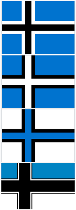
The first one!
Just a black cross with blue field above and white field below, essentially the current flag with the middle black band as a cross. Also effectively a less reich-y version of the last one in this list.
I kinda like the middle one the best, you really need to have blue-black-white in that order somewhere on the flag, to still represent the classic winter imagery of blue sky, black forests and white snowy fields.
The bottom one also contains that combination but is too similar to the Finnish flag.
Why are people saying the middle one? There are four flags, there is no middle one...
Probably some Lemmy app's view type cutting it off at the bottom.
3rd one is my favourite. Number 4 looks fascist to me
If you mean which one looks best in a vacuum, I'ma go with the last one. Very bold and eyecatching. But folks think it has a fashy vibe, so I can see not using it in the real world; in which case I like the third.
the middle one looks best imo
