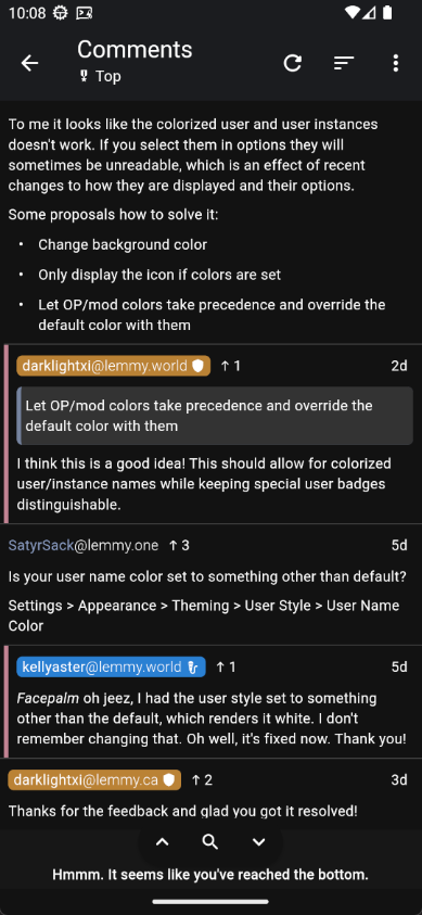
Is your user name color set to something other than default?
Settings > Appearance > Theming > User Style > User Name Color
An open-source, cross-platform Lemmy client for iOS and Android.
This community is intended to discuss features and feature suggestions for Thunder; as well as friendly, respectful talks about Lemmy in general.
Please use the GitHub repository linked below to submit bug reports, so keeping track of them is easier, and make sure to search first if you already can find an issue for your report.
If there are any developers who would like to contribute, feel free to reach out on GitHub!
General Links
Website: Link
GitHub Repository: Link
Matrix Space: Link
Android Releases
IzzyOnDroid: Link
Google Play: Link
iOS Releases
Apple App Store: Link
TestFlight Beta: Link
Related Communities
Nightly Community: Link
Is your user name color set to something other than default?
Settings > Appearance > Theming > User Style > User Name Color
Facepalm oh jeez, I had the user style set to something other than the default, which renders it white. I don't remember changing that. Oh well, it's fixed now. Thank you!
I had the same issue as OP.
Even if the default color works, I still think there is an issue somewhere here that should be addressed.
To me it looks like the colorized user and user instances doesn't work. If you select them in options they will sometimes be unreadable, which is an effect of recent changes to how they are displayed and their options.
Some proposals how to solve it:
Let OP/mod colors take precedence and override the default color with them
I think this is a good idea! This should allow for colorized user/instance names while keeping special user badges distinguishable.
Let OP/mod colors take precedence and override the default color with them
I think this is a good idea! This should allow for colorized user/instance names while keeping special user badges distinguishable.
Just chiming in here to say that this has already been implemented in the current prerelease and should be available in the upcoming general release!

Thanks for the feedback and glad you got it resolved!