Thank you so much! 🙏
BuzzyBumblebee
joined 1 year ago
Hi there, thanks for all your work on this app! The latest major release introduced a visual bug and I was wondering if you could please fix that. Namely, adding visual clutter in the form of non-uniform coloration in the comments view.
Figure 1: Picture of a phone running an older version of the app:
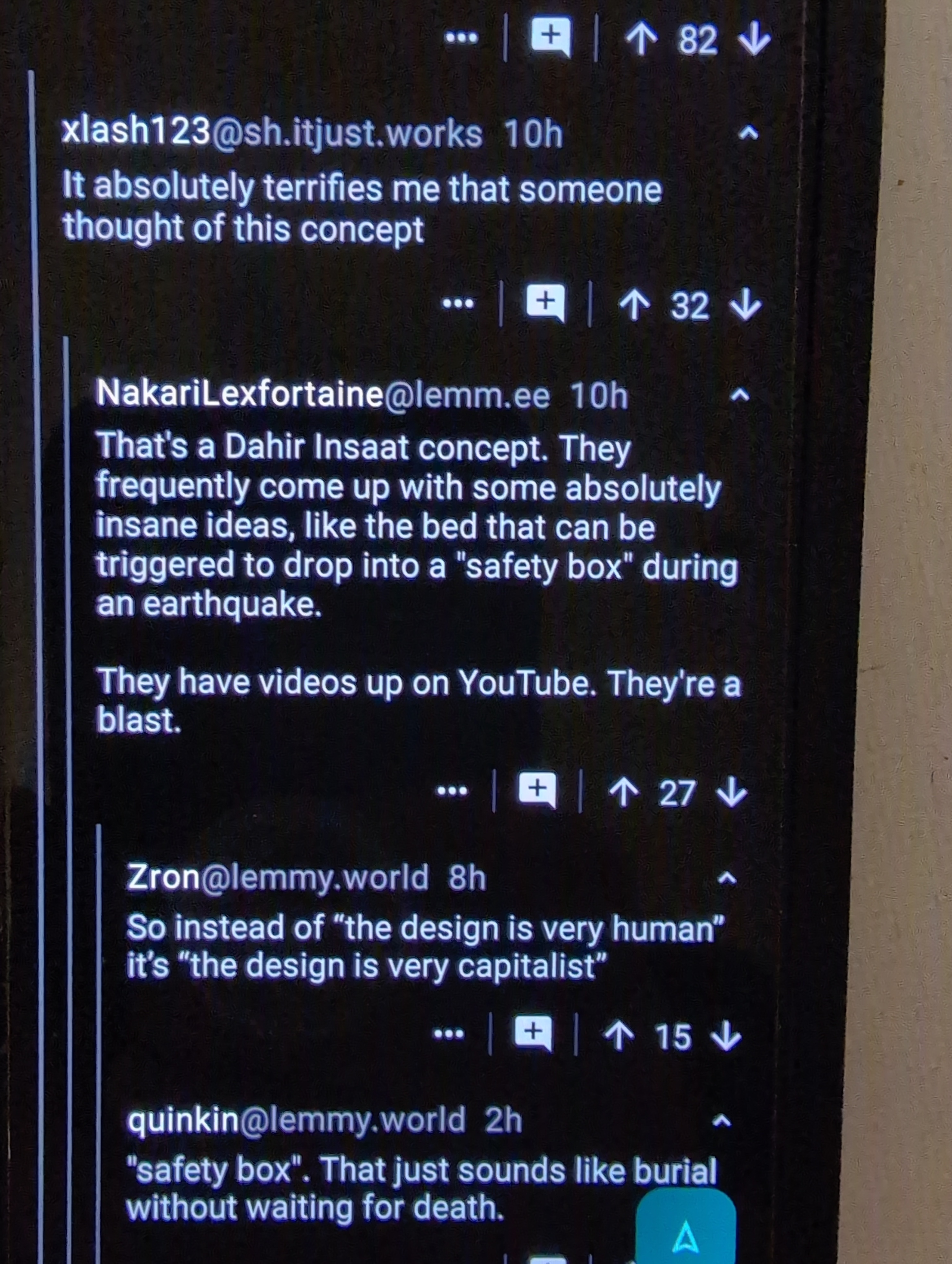 .
.
Note how the comments and dividers are clean, the lines to indicate tabbing are uninterrupted, the upvote/downvote/actions bar is the same color as the rest of the backgrounds.
Figure 2: Screenshot from the latest version of the app. I've highlighted in red the color discontinuities, but also left 2 visible below unhighlighted:
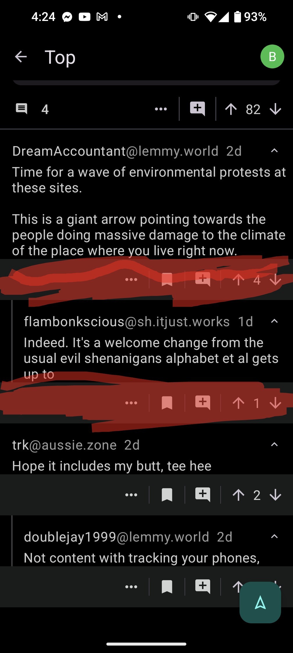
To my eye the first picture with the older UI looks far better and is much less cluttered.
Meta is absolutely not to be trusted, defederating from them is the right call!
Looks good, thank you so much!