this post was submitted on 21 Oct 2024
853 points (98.9% liked)
RetroGaming
19602 readers
390 users here now
Vintage gaming community.
Rules:
- Be kind.
- No spam or soliciting for money.
- No racism or other bigotry allowed.
- Obviously nothing illegal.
If you see these please report them.
founded 1 year ago
MODERATORS
you are viewing a single comment's thread
view the rest of the comments
view the rest of the comments

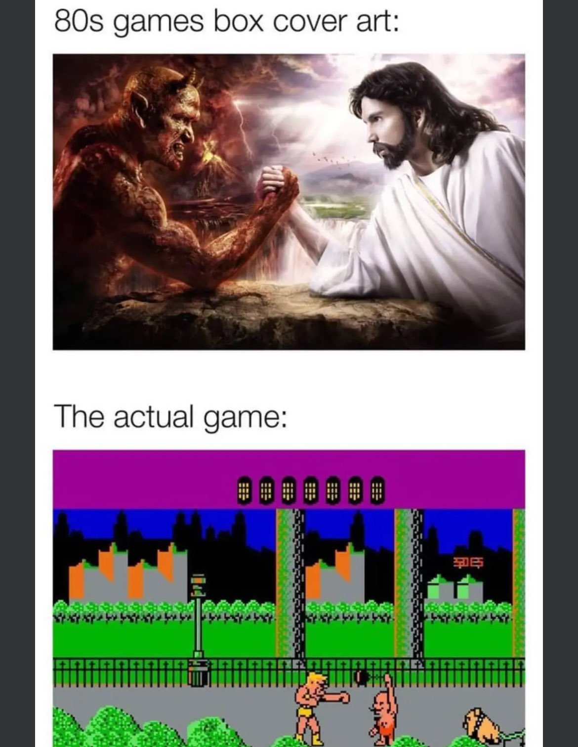
I can't research it at the moment, but I want to say that was a common thing in the pre-NES days, and I think Nintendo required actual gameplay graphics to be shown on the box because of that.
Could be off on the specifics, but I do vaguely recall those kinds of non-representative box art having some controversy.
Mega Man would like a word.
Just look at that sexy bastard.
Maybe they got a pass if the in-game graphics were better than the box art? 😆
What do you mean? This is the greatest art in the history of art. It makes me FEEL something. Those in game graphics don't make me feel at all.
That feeling is called nausea
Mind you, that was only American artwork. Original Japanese:
That's quite the banana hammock he's wearing.
Wtf did they do to his legs??
Nintendo of America often used pixel art for their own box art early on in the NES era. It was similar to the in game graphics, but usually more detailed. See Metroid’s original artwork. If there was a requirement for third parties, perhaps it could be met by simply including screenshots on the back.