this post was submitted on 20 Nov 2024
111 points (98.3% liked)
Map Enthusiasts
3496 readers
197 users here now
For the map enthused!
Rules:
-
post relevant content: interesting, informative, and/or pretty maps
-
be nice
founded 2 years ago
MODERATORS
you are viewing a single comment's thread
view the rest of the comments
view the rest of the comments

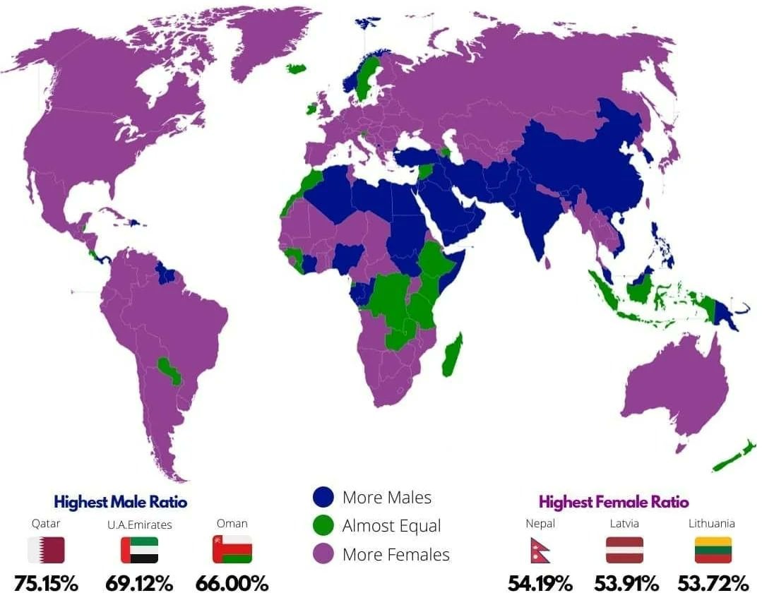
I find the top three ratios interesting: there's a tiny skew towards females but a huge skew towards males.
It doesn't show what the green threshold is though. From memory, the natural birth ratio is 49:51 m:f, so the female skew is only about 3% while the male skew is about 20%. Seven times larger.
If I were colouring the map, I don't think I'd have bothered with differentiating purple and green, or perhaps used more graduations.
My guess is that there isn't a country out there that has a cultural preference for women over men, so at best you're going to see fairly close to equal, plus the difference of men dying earlier from things like wars, dangerous jobs, and lifestyle.
Whereas there are many cultures that strongly select for male children, plus some that also bring in high numbers of male workers.
Yep, that's the point I was circling around ;-)
I was wondering if there was a correlation between purple and war. There certainly was in early C20 post world-wars.