this post was submitted on 20 Nov 2024
111 points (98.3% liked)
Map Enthusiasts
3496 readers
203 users here now
For the map enthused!
Rules:
-
post relevant content: interesting, informative, and/or pretty maps
-
be nice
founded 2 years ago
MODERATORS
you are viewing a single comment's thread
view the rest of the comments
view the rest of the comments

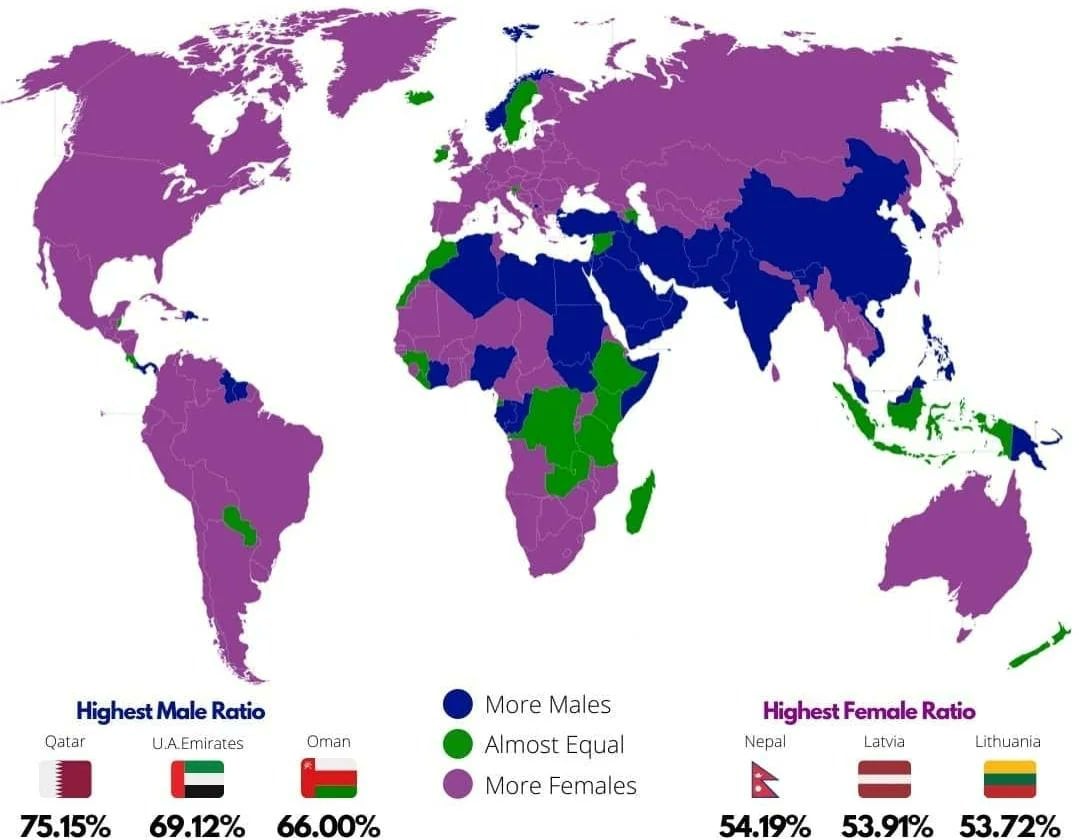
I find the top three ratios interesting: there's a tiny skew towards females but a huge skew towards males.
It doesn't show what the green threshold is though. From memory, the natural birth ratio is 49:51 m:f, so the female skew is only about 3% while the male skew is about 20%. Seven times larger.
If I were colouring the map, I don't think I'd have bothered with differentiating purple and green, or perhaps used more graduations.
Just a guess, but I think the difference in a country like Qatar can be explained by the import of labor. They hire a workforce from a different country which tend to be dominantly male in those regions. And we've seen with the football WC how they're developing.
https://seasia.co/infographic/qatar-population-by-nationalities-2024 reckons 20% of the entire population of Qatar are Indian. If that's mostly workforce then yeah. It could easily be the skew.