this post was submitted on 18 Jun 2023
337 points (99.1% liked)

Lemmy.World Announcements

29077 readers
84 users here now

This Community is intended for posts about the Lemmy.world server by the admins.

Follow us for server news ๐Ÿ˜

Outages ๐Ÿ”ฅ

https://status.lemmy.world

For support with issues at Lemmy.world, go to the Lemmy.world Support community.

Support e-mail

Any support requests are best sent to info@lemmy.world e-mail.

Report contact

Donations ๐Ÿ’—

If you would like to make a donation to support the cost of running this platform, please do so at the following donation URLs.

If you can, please use / switch to Ko-Fi, it has the lowest fees for us

Ko-Fi (Donate)

Bunq (Donate)

Open Collective backers and sponsors

Patreon

Join the team

founded 2 years ago
MODERATORS
 

Reddit refugee here.

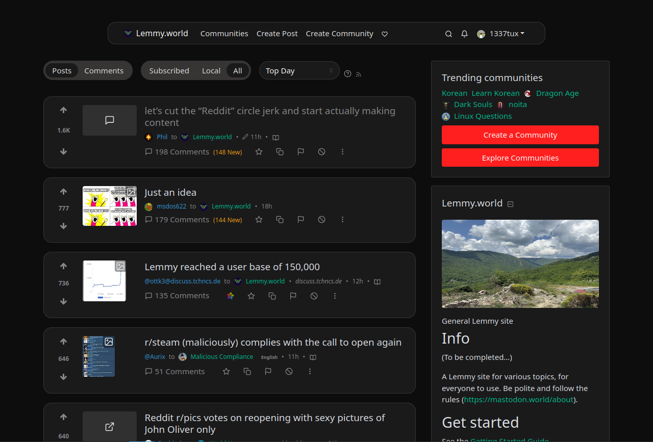
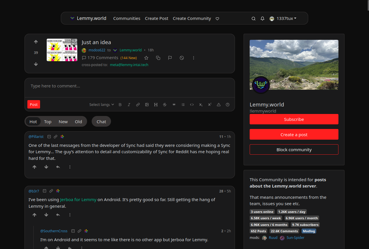
I have really started to like Lemmy and love the fact that it's free and open source, but I wasn't feeling so home with the UI, so I found nice looking style from https://userstyles.world/style/10345/lemmy-world but I personally prefer dark theme so I adjusted some colours and made the radiuses and margins bigger. I thought that maybe someone will find this useful and hence I decided to post it here. I am not a professional programmer, just a guy who likes to tinker with computers so this style may not be perfect. Critique, feedback and suggestions are welcome.

Edit: The colors are from reddit and if you want the colors to look more like the original lemmy, change the bg primary and default to hex #303030 and #222222. I really like this color scheme too

--bg-primary: #303030;
--bg-default: #222222;

Edit2: I have now made some small adjustments using the feedback and suggestion I got from you. I'm really grateful for the feedback :)

I also have now two styles, which have slightly different color scheme https://userstyles.world/user/VILPAUTOEE

Keep the feedback coming ;D Thx

you are viewing a single comment's thread
view the rest of the comments
[โ€“] kabe@lemmy.world 4 points 1 year ago

The main problem with the Lemmy UI on desktop, IMO, is the cramped and narrow page width. There's so much wasted space on either side of the content.

I'm currently using a customized version of this one: https://github.com/HrBingR/Lemmy_CSS