this post was submitted on 14 Jan 2024
1431 points (97.3% liked)
Greentext
4464 readers
1246 users here now
This is a place to share greentexts and witness the confounding life of Anon. If you're new to the Greentext community, think of it as a sort of zoo with Anon as the main attraction.
Be warned:
- Anon is often crazy.
- Anon is often depressed.
- Anon frequently shares thoughts that are immature, offensive, or incomprehensible.
If you find yourself getting angry (or god forbid, agreeing) with something Anon has said, you might be doing it wrong.
founded 1 year ago
MODERATORS
you are viewing a single comment's thread
view the rest of the comments
view the rest of the comments

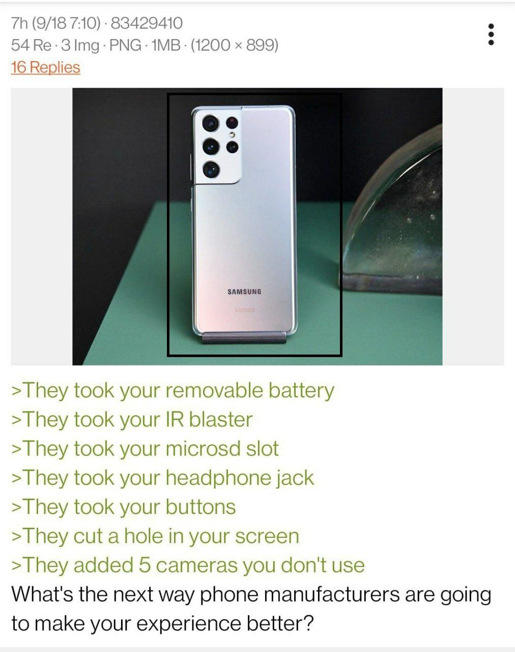
I love it when uninformed troglodytes complain about a hole in the screen. They didn't add a hold in the screen. The hole was already there. They just wrapped your screen around it for more screen. 😅
Haha, that's a pretty good point.
It's really infuriating seeing the downvoted on some other replies that point this out. The time/notifications/battery bar along the top used up screen space. Now those notifications are in the formerly dead space with the camera. It is objectively better. It's not debatable because there is measurably more useable screen space without making the phone larger.
That's nothing. Wait until manufacturers figure out that the optimal place for that "hole" is 1-2 inches lower than that. People are going to have a fit about dead pixels in the middle of the screen, even though they can now facetime with "eye contact".
That's been solved already by apple and nvidia: Just correct your eye direction with ai.