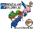
We had a lot of participants last year, but much of Lemmy didn't know about it happening because there wasn't a lot of notice in advance. This time we get a bit more notice.
Do we want to plan what to do in advance?
Kia ora and welcome to !newzealand, a place to share and discuss anything about Aotearoa in general
Rules:
FAQ ~ NZ Community List ~ Join Matrix chatroom
Banner image by Bernard Spragg
Got an idea for next month's banner?
We had a lot of participants last year, but much of Lemmy didn't know about it happening because there wasn't a lot of notice in advance. This time we get a bit more notice.
Do we want to plan what to do in advance?
I think a bit of planning wouldn't go amiss
We did well last year (and also helped aussie.zone towards the end)
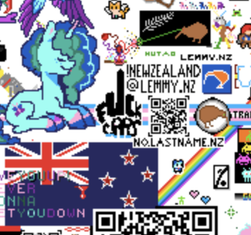
Yeah, last year we started small with the little "lemmy.nz", and added more and more on as we were getting through it quicker than expected. This year we could possibly plan out what we want ahead of time with more ambition to try to get something that covers similar stuff but is more cohesive.
I’ll follow whatever plan you guys come up with! I don’t know if I’ll be able to spend as much time on it as last time though
I'm no artist, but I can try to come up with something. I'm not sure how much time I'll have either! Hopefully we can do a decent job anyway.
Also see:
Last year's final canvas
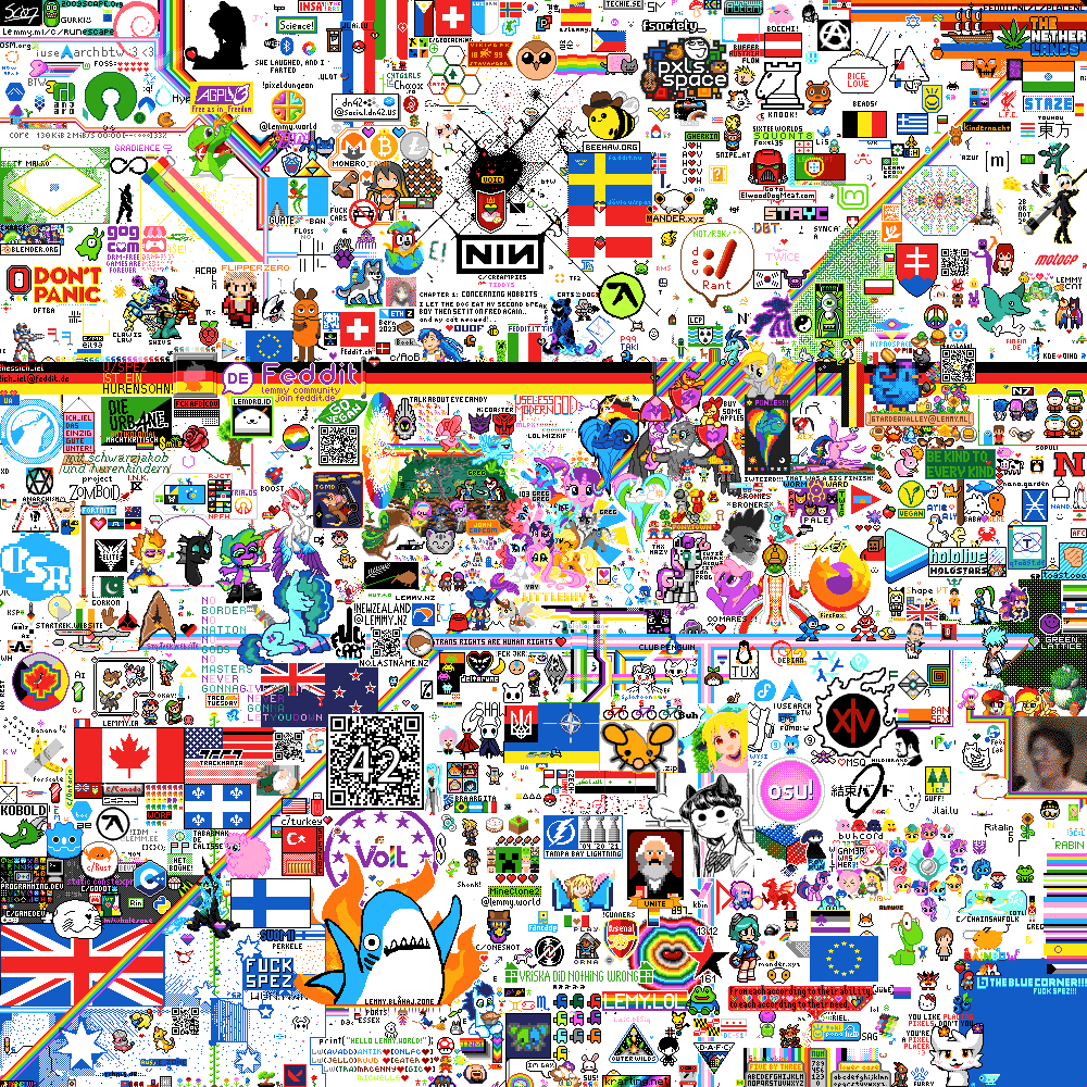
See timelapses and more in the ending post from last year: https://lemmy.nz/post/820571
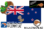
@BlueEther@no.lastname.nz @eagleeyedtiger@lemmy.nz and anyone else, what do you think of this? I've pulled together some of the things from last year plus added something new (I hope it's recognisable).
I have heard the canvas will be smaller this year, I think in response to all the leftover space last year. So I think we will need to be prepared to move things a bit. Maybe we start with the New Zealand flag, building into the others as we get to them but moving them a bit if others have taken the space? We can coordinate on matrix again.
I like the fantail, although I feel doing the same flag is kind of boring. Could we recreate something like this: https://www.shutterstock.com/image-vector/new-zealand-flag-map-pixel-art-1092031517
Not to sound ungrateful or anything!
Great idea! More like this?
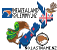
Yeah that's ok by me. The sliced kiwi placement doesn't look entirely right, but I can't see where else to put it. Keen to hear what others think
I have commented over here with the template to follow once it starts. Have slightly changed the angle of the kiwi and aligned it to the new colour palette they are using.
maybe push the !newzealand@lemmy.nz a little higher and rotate the kiwi fruit kiwi?
I think the issue is the kiwifruit kiwi image seems to be supposed to be sitting down or something? If you rotate it to how a kiwi walks, it doesn't look right. Maybe it's climbing the side of the South Island?
