I’m doing my part 🫡
Aotearoa / New Zealand
Kia ora and welcome to !newzealand, a place to share and discuss anything about Aotearoa in general
- For politics , please use !politics@lemmy.nz
- Shitposts, circlejerks, memes, and non-NZ topics belong in !offtopic@lemmy.nz
- If you need help using Lemmy.nz, go to !support@lemmy.nz
- NZ regional and special interest communities
Rules:
FAQ ~ NZ Community List ~ Join Matrix chatroom
Banner image by Bernard Spragg
Got an idea for next month's banner?
Thanks!
Every pixel (and more) has been placed! Great work everyone :D

Amazing! Only 1/3 of the way in!
I'm playing with some sort of background for the !newzealand@lemmy.nz bit, am starting by extending the blue kiwi background leaving a white border around the text, but might end up doing all around the text and making the text white.
I threw a few pixels your way! Let me know if you would like some more help with it and if you have a template ready for it.
I'm in the process of continuing the lazer beam to the edge of the canvas, if you want to help with that?
I just threw this together, I think it will look better than the white outline around the black since there isn't really room for the outline around the text:

It's supposed to fit perfectly over the existing logo and text, so hopefully the link works 🙂
I've now started on a lazer beam for the big kiwi, going straight across the canvas, with the intention to carry on right to the far side.
Who else is in?
What's the plan to connect it with the eyes?
Probably widen the beam, I started there because there is bit of a gap in the canvas I wanted to stake a claim to.
Ok, I'll follow your lead
Like the smaller one on the left, we'll run it behind existing drawings.
I'm gonna give the kiwi lazer eyes.
I knew it would happen 😆
It's starting to look like something now.
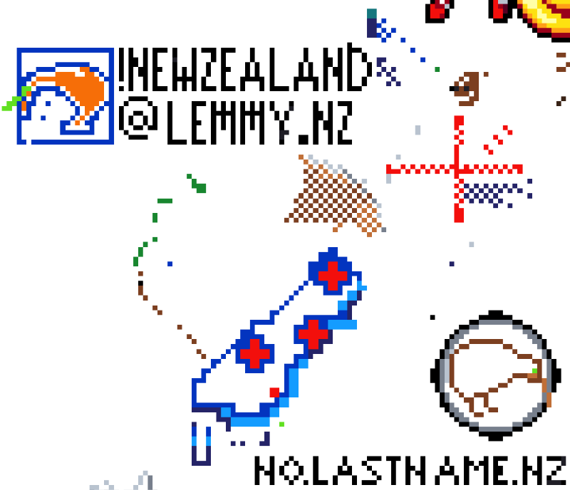
I'm Aussie, but I'm helping out as the design is much cooler than just a flag (which is what the Aus comm is doing). Is the Kiwi going to get lazer eyes?
Thanks for the help! Hadn't thought that far ahead. No reason it can't have laser eyes 😆
It isn't that I hate the flag, it's just been done over and over. I would much prefer something else to get behind.
The small one is, no reason why we can't do the big one. I was thinking straight across for him/her/them.
If it's not clear, click the "Login" part of this at the bottom. It seems the formatting is a bit broken:

Edit: Looks like they fixed it a bit, now it looks more like a button.
Sorry, messed up the link a little. Here is an updated one where the alignment should be better: https://canvas.fediverse.events/#x=162&y=328&zoom=4&tu=https%3A%2F%2Flemmy.nz%2Fpictrs%2Fimage%2F497358ad-b655-4ae1-9e42-ea70c303a63e.png&tw=112&tx=100&ty=300&ts=ONE_TO_ONE
And by default the template is solid, but not too helpful like that. In the settings at the top left you can change the opacity to make it transparent.
It's coming together nicely
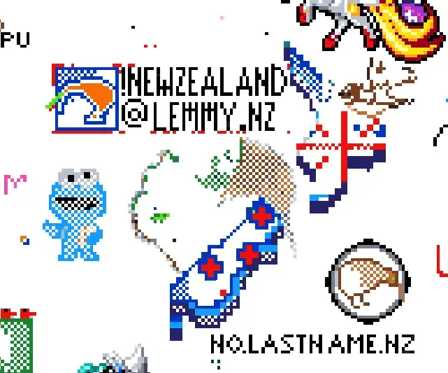
You've done some amazing work on that big kiwi! Just woke up to find how much progress you've made during the night.
Thought I''d post an update. Looking good! I've started to fill in some background and doing some refinement on the edges of where things touch.
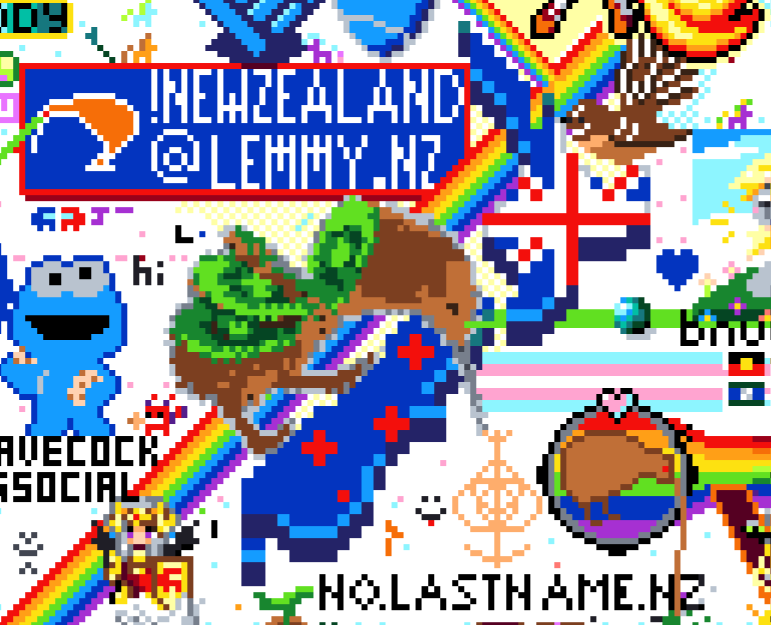
I tried, got the code, then a 400 bad request.
Try again 😆. There are teething issues, and the main dev has been doing patches to fix things several times. When this happens, the server goes down for a few minutes each time. Many bugs are being resolved but there are still some quirks.
I'd suggest to try to follow through the process again and see if you get it working. If not, try again tomorrow.
OK I'm in. Never done this before. Will have a look!
Great! After login, you might need to come back to this lemmy post and click the link with the template. Then in the settings of Canvas, reduce the template opacity until you can see what's already done. Then pick the colour that matches the square you want to colour, and click!
You can only place one pixel every 32 seconds, but if you go away then these stack up to a maximum of 6 that you can place all at once.
Yep just placed a couple! Thanks.
I placed a pixel. Oh yeah!
Nice! At the moment I'm just working on securing the edges before I go to bed, by colouring the appropriate pixels just around the edge. Hopefully that stops anyone overwriting our progress while we sleep.
I do like how they let you build up pixels.
Morning progress. Amazing work by whomever worked after I went to bed!
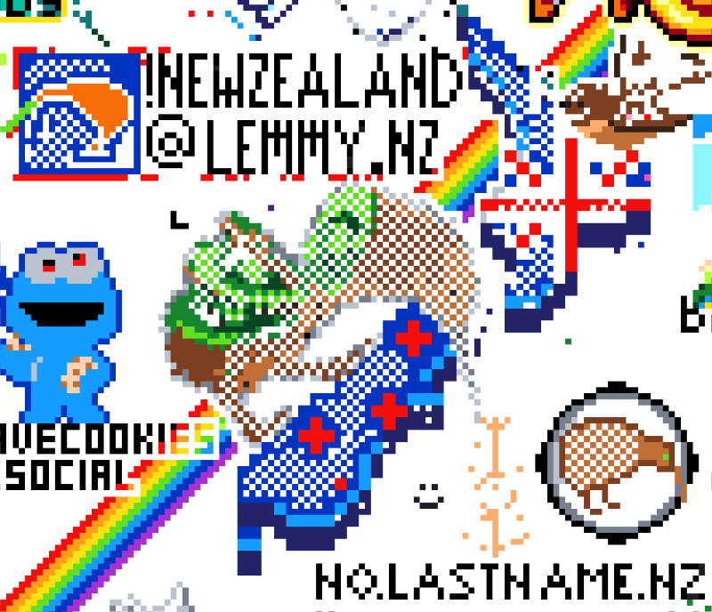
Done!
Here's our part:
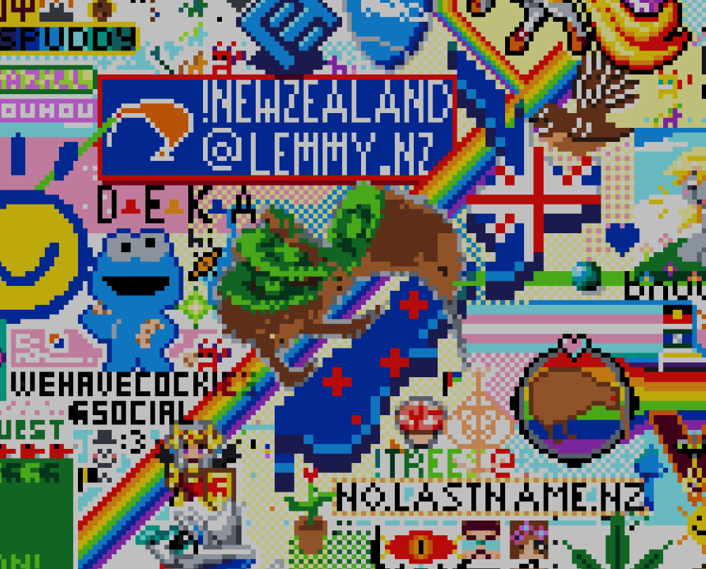
If anyone wants to see the whole canvas it's at: https://canvas.fediverse.events
Really happy with how this turned out :)
Me too! Looks amazing!
I'm routing the ocean/river through Aotearoa / NZ along with a few boats. If you follow it back there are plenty more boats on it as well as a kraken. It's really cool.
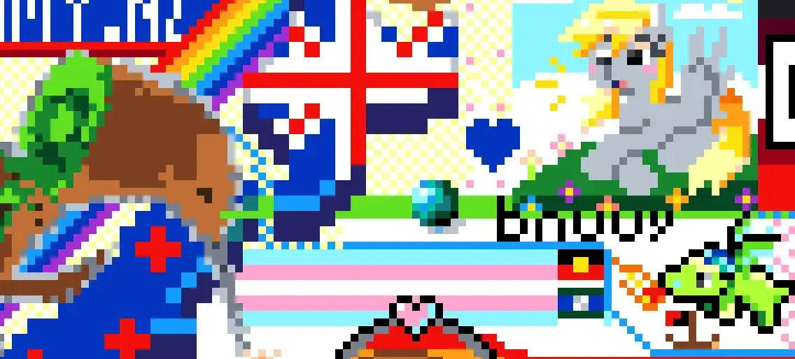
Also, someone made my pot plant flower, which looks really nice :)
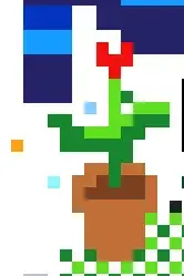
I'll help! I was doing the yellow background but apparently I'm not smart enough for that because despite careful measuring when two parts came together they didn't line up 🤦
It's ok. I've lined it up with whatever you had going. I also added a border around "no.lastname.nz" as it was getting hard to read
Edit: also thanks for helping continue the water!
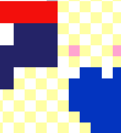
This is the part I messed up which is a little bit away from where you're working. I re-did some of it so it wasn't so obvious, I think it looks OK now:
I also squeezed in a mini @thevoyagekayaking@lemmy.nz, not sure what do do about the 'hi' though. It doesn't seem to be part of anything around it. The black on black doesn't quite work.
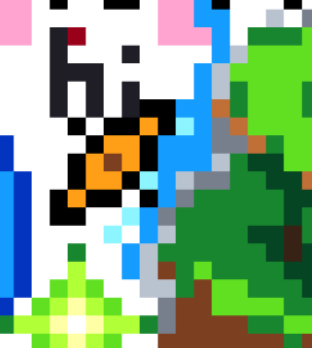
This is the part I messed up
Oh, that bit! I got confused when I got there so I just put two pink pixels down as 'flowers' and left that area. It looks really nice right now :)
Thanks for figuring out how to wrap the water stream around the kiwi. I didn't quite know how I was going to get around the "A", but you found a good spot.
Currently I'm trying to get the yellow pixel background continuing on the right hand side, but am not sure what to do with the text when it eventually reaches it. I'm up for any ideas?
For the no.lastname.nz bit, I think leave the background of that white and treat it like a white rectangle, don't go behind the text. For the !trees bit, probably the same. Might make sense to focus on the bit to the left of the bottom of the south island.